

CLIENT: waddle meal plan
ROLE: brand identity, brand strategy, art direction + design system
Waddle is an off-campus meal plan designed to help students explore small businesses and give parents the oversight to know how their child is spending their funds. The business thrives off two key factors:
support
(parents)
(students)
(restuants)
connection
(parent to student)
(student to community)
(restaurants to student body)
|
|
|
|
︎
united through food
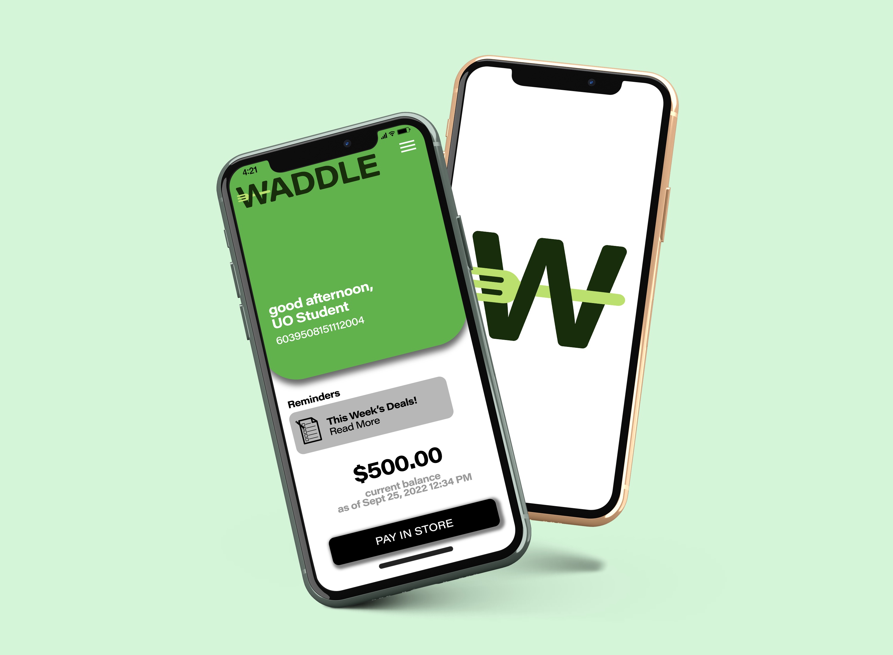
DESIGN SYSTEM
logo
wordmark

letterform

Icons


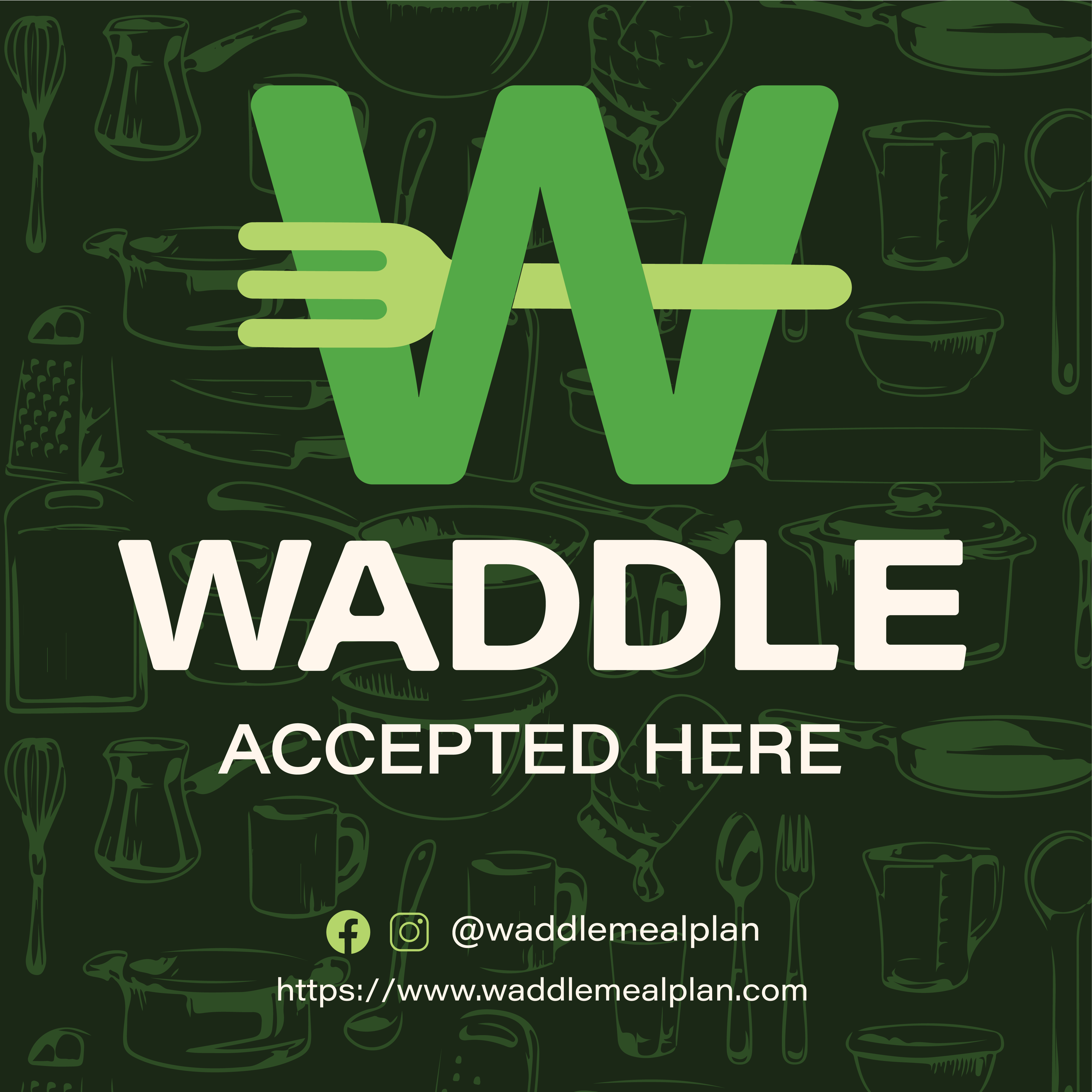
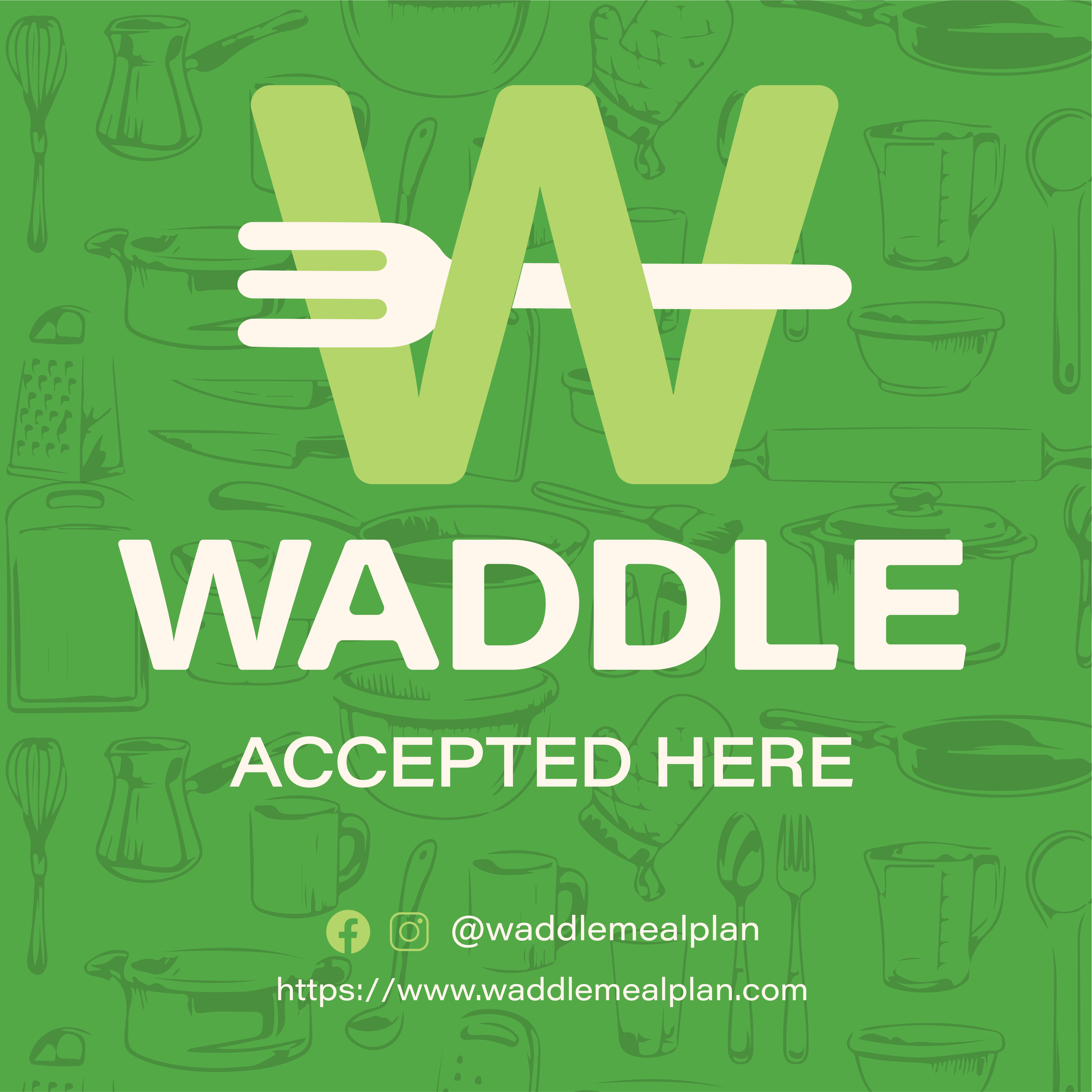
the W
the waddler’s mark
the fork
The W is the key signifier for waddle. It stands as a beacon of sanctuary for waddler’s seeking vetted restaurants.
The Waddler’s Mark is a symbol of exploration. It personifies the students seeking food outside the domain of campus.
The Fork is the unifying icon of waddle. It encompasses direction, utility, and connection through historic connotation and visual aesthetic.
WINDOW STICKERS


BUSINESS CARDS + LANDING PAGE

SOCIAL
letterform serves as signifier ------------
waddler’s mark indicates a new vendor -----

----- cohesive highlight covers
THE WADDLER’S CLUB
For those interested in taking gaining bigger deals and exclusive invites to events, waddler’s have the oppurtunity to join the waddler’s club: an exclusive community-driven subscription with a merch pack to welcome new members.

